Website carousel sliders: Why, how and when to use them (including 13 examples)


Let’s talk about website carousels, aka sliders, aka slideshows, aka galleries.
It seems like the entire internet has its own variation, but collectively we all mean that design element with the moving content and oftentimes, displays three little dots on the bottom.
When it comes to carousels, you’re either on team 👏 or team 🙅. The first team typically includes the clients, the second team the web designers.
Here at Ycode, we’re Switzerland. We believe carousels can be the centerpieces that make your web design more appealing, but that they also have the potential to drag your website’s usability down.
In this article, we’ll look at carousel best practices (and what to avoid). Since carousels can be used for many occasions, we’ll show you different examples of sliders done well.
Carousel design best practices (or mostly, what not to do)
Though they are used on many websites, carousel designs can easily miss the mark. There are a few good reasons why. Let's start with some things to avoid before we tell you about what carousel best practices you should use.
👎 Don’ts: Carousel mistakes to avoid
Content: When a carousel wants to do too much in too little time, it can cause website visitors’ eyes to spin. Text can’t be properly read, information is missed and visitors lose interest.
Design: If a slider is poorly designed and won’t blend into your website design, it can get mistaken as an ad. As a result, people scroll right past the content. It’s called banner blindness, a web design phenomenon where people ignore content that resembles an ad—consciously or unconsciously.
SEO: From an SEO perspective, avoid multiple H1 headers if you use sliders as the first thing on the page. Each web page should have one H1 in its HTML code. If you use several H1s because of the different slides, Google may be confused about which keywords are the most important ones for that web page. Also, the website structure may not be clear. Both factors could negatively impact your ranking.
Mobile: For mobile devices, it’s best to go for manual sliders. Make sure gestures are supported (e.g. mobile users swiping to show the next slide) and that the arrows are clearly shown and large enough to press. If your slides contain text, check whether it’s readable on mobile screens.
Rotation: With our limited attention span these days, it’s hard to keep the user’s interest for longer than a few seconds. Since we’ve all got places to be, keep the slider-amount low (less than five) and give visitors the opportunity to control the carousel by showing slider controls. This makes sure people don’t have to sit and wait for the next slide.
👍 Do’s: Carousel best practices
Keep each slide simple so the information can be digested within seconds.
Make the design blend in with the rest of your website.
Let people control the rotation with clear arrows.
Have enough time between slides (5-10 seconds), or even better, ditch autoplay altogether.
Less is more (both in design and amount of slides).
Before you insert a carousel, ask: Will this add more value than static content?
Having second thoughts?
When in doubt, test both options and see which option generates a higher conversion rate. Oftentimes, clients ask for slideshows because they’re not clear on the message they want to promote first and foremost. Why not show everything? They think.
If that’s the case, the work is in crafting a more focused message—not using a slider. Or, pick the important USP (Unique Selling Point) and mention the other ones further down the page. People are more likely to scroll than to flip through your slides.
If you do decide it’s a hell yes, pick each slide intentionally. Don’t just add all your new blogs or products, but carefully pick the most important content that could generate the most interactivity from users.
13 website carousel examples
Now that you know what not to do, let’s look at carousel examples that are nailing it. Here are 13 website carousel examples, from homepage to product and image slideshows. If you're looking to create a visually appealing slider for your site, using an Al presentation maker can help you build dynamic, engaging carousels with ease.
Homepage carousels
If you thought the camps were already divided enough, you haven’t met homepage sliders. Some root for placing them directly at the top (often seen in blog templates), while others don’t want to see them implemented anywhere above the fold.
The reason why people avoid placing a homepage carousel directly at the top is because they believe this space should be reserved for a clear message that entices the reader to scroll down and learn more. With carousels, it’s hard to convey one strong message. Plus, you’re not sure if people are seeing all slides or scrolling right past.
However, there are also plenty of people who love greeting visitors with a homepage carousel to instantly show featured stories or products.
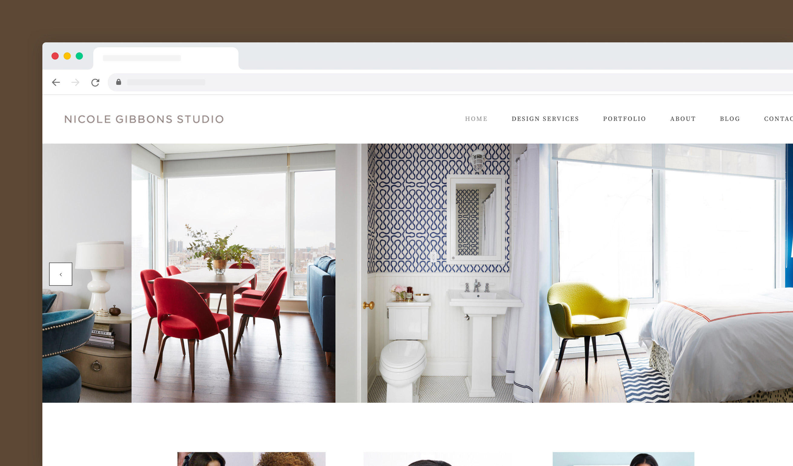
Example 1: Nicole Gibbons Studio
The homepage carousel from Nicole Gibbons Studio works really well! That's good for a couple of reasons.
It has good functionality and adds value. Designer Nicole quickly shows different interior examples directly when people enter her website
The slides are manual, so the user decides if and at what pace they want to flip through
There’s no text overlap to take away from the imagery
Example 2: Urban Skin RX
We love this compact carousel from Urban Skin RX, as it has great accessibility.
It incorporates two slides, both attractively designed in the same style as the rest of the website. The rotation time is set long enough to read the text. The big fonts and clear call to action (CTA) buttons make it easy to digest what the slide is about.
Note: If you scroll through the brand’s homepage, you’ll see that it's tailored to people who are already familiar with Urban Skin RX. The focus is on showcasing products, without explaining why someone needs them in the first place. That’s why a product slider fits the page—they don’t need the header space to show one clear message that motivates visitors to discover more.

Example 3: Mejuri
What we love about this carousel from jewelry shop Mejuri is that it shows two different things at once, without feeling overwhelming.
The entire carousel contains three slides, of which each one has two options—see the campaign or shop the jewelry. The progression lines are subtly shown at the bottom, though you might need eagle eyes to spot this. This could be a point for optimization.

Example 4: Fresh Brothers Pizza
Who says a slider needs to span the full width of a page? You can also break up sections into grids and use smaller sliders, like on the homepage of Fresh Brothers Pizza.
Granted, with this web design layout, things can get a little much. Though the sliders do show visitors information, the eye is drawn to the big image on the left. Not everyone will see the slider information. However, since the information is about COVID measures and new pizzas that people will anyway see when making their order, this isn’t a big deal.
Product carousels
Product carousels are there to visually allure people into learning more about the product, and well, hopefully buying it!
These types of carousels are usually placed on one of two spots on e-commerce sites: the homepage or product page. The slider can show different products or one product in different ways (showing its features).
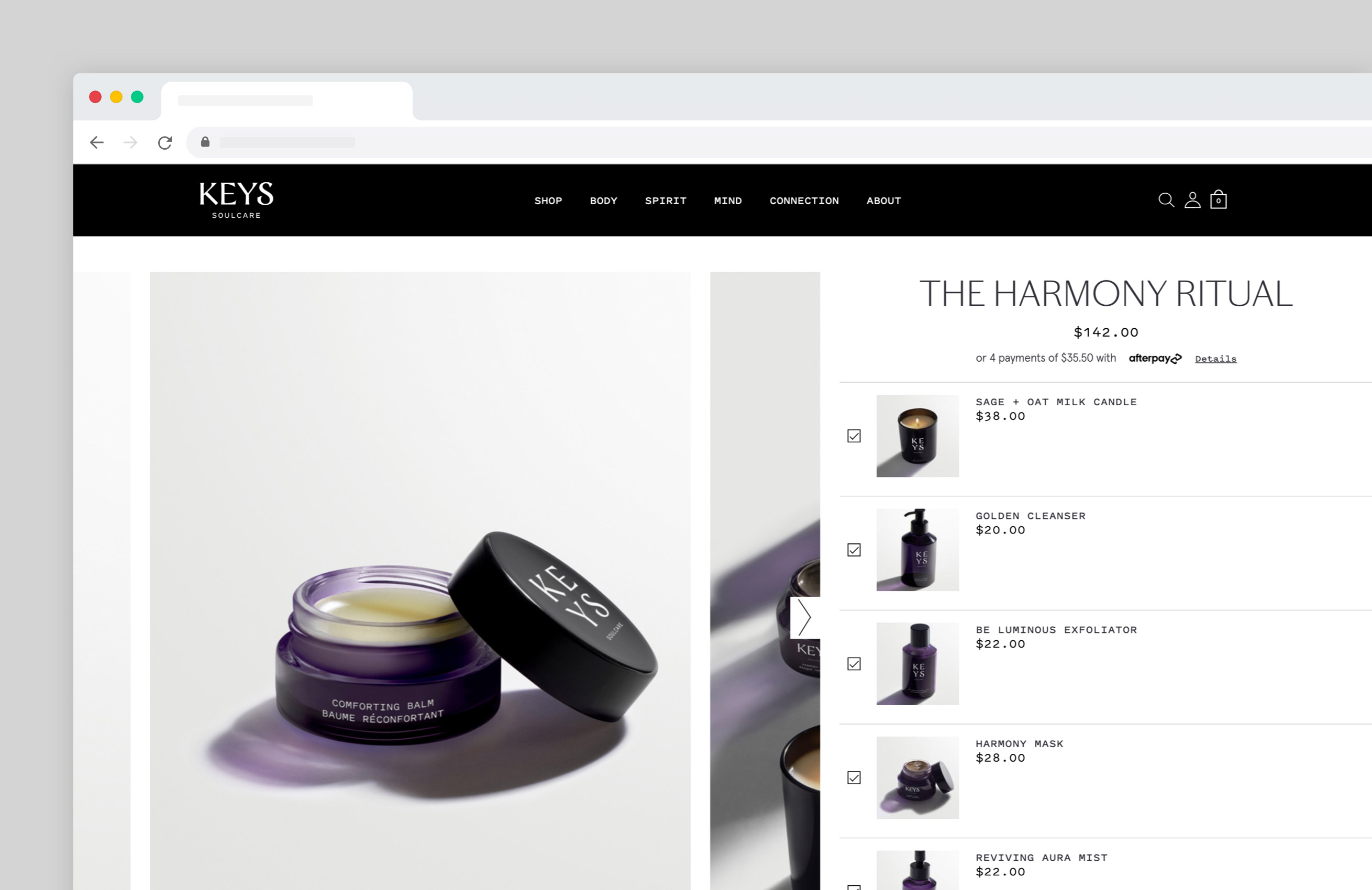
Example 5: Keys Soulcare
On this Keys Soulcare product page, a carousel is used to display each item that’s included in the Harmony ritual package. A slider fits the website design perfectly, as it lets visitors see all relevant information without having to scroll.
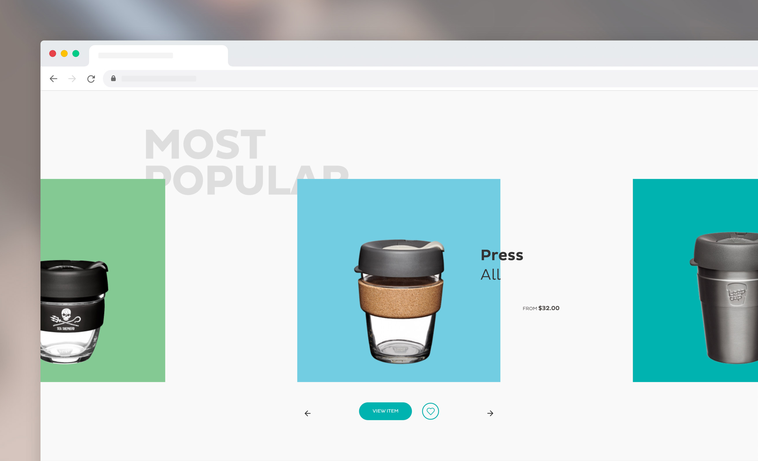
Example 6: KeepCup
This product carousel from KeepCup is placed in the middle of the e-commerce site and lets you easily browse through the brand’s most popular to-go cups. Take note of how the name, price, buy button and arrows are placed—super sleek (props to the graphic designers).
Example 7: Homesick
Candle company homesick uses a variety of slider elements on their e-commerce website, to showcase their candles as well as reviews and quotes from brands.
Midway down the homepage, there’s this slideshow—a moving gallery of their best-selling candles (we love the scent concept!). Once you hover over an image slider, it stops and a slightly different image is shown (for example, showing the candle getting lit).
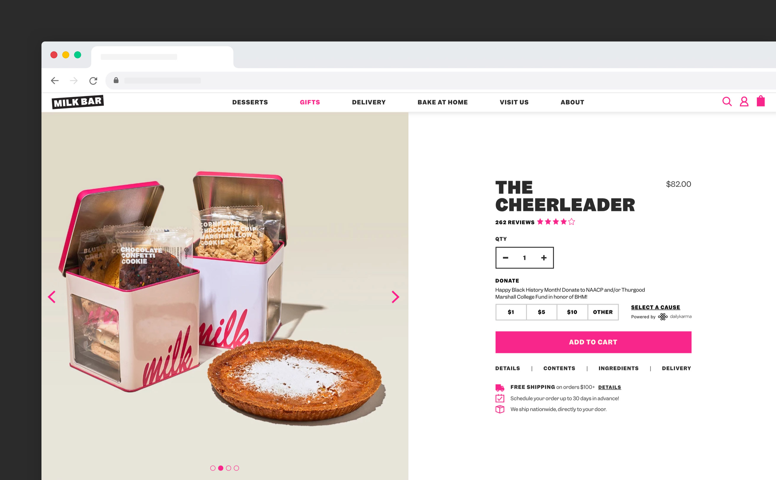
Example 8: Milk Bar
Milk Bar’s product pages are a joy to scroll through, and not just because the pictures are mouth-watering. Take The Cheerleader web page below, with the slider element on the left and all product details on the right, visitors see everything at first glance.
However, when you scroll down, you’ll see interactive banners and more product information like delivery, ingredients, similar treats and another carousel displaying customer reviews.
Content carousels
If you want to add a content carousel to your website, keep in mind that the most valuable piece of content has to be in the first slide. The initial slide will always get the most exposure, and impressions decrease after every additional slide.
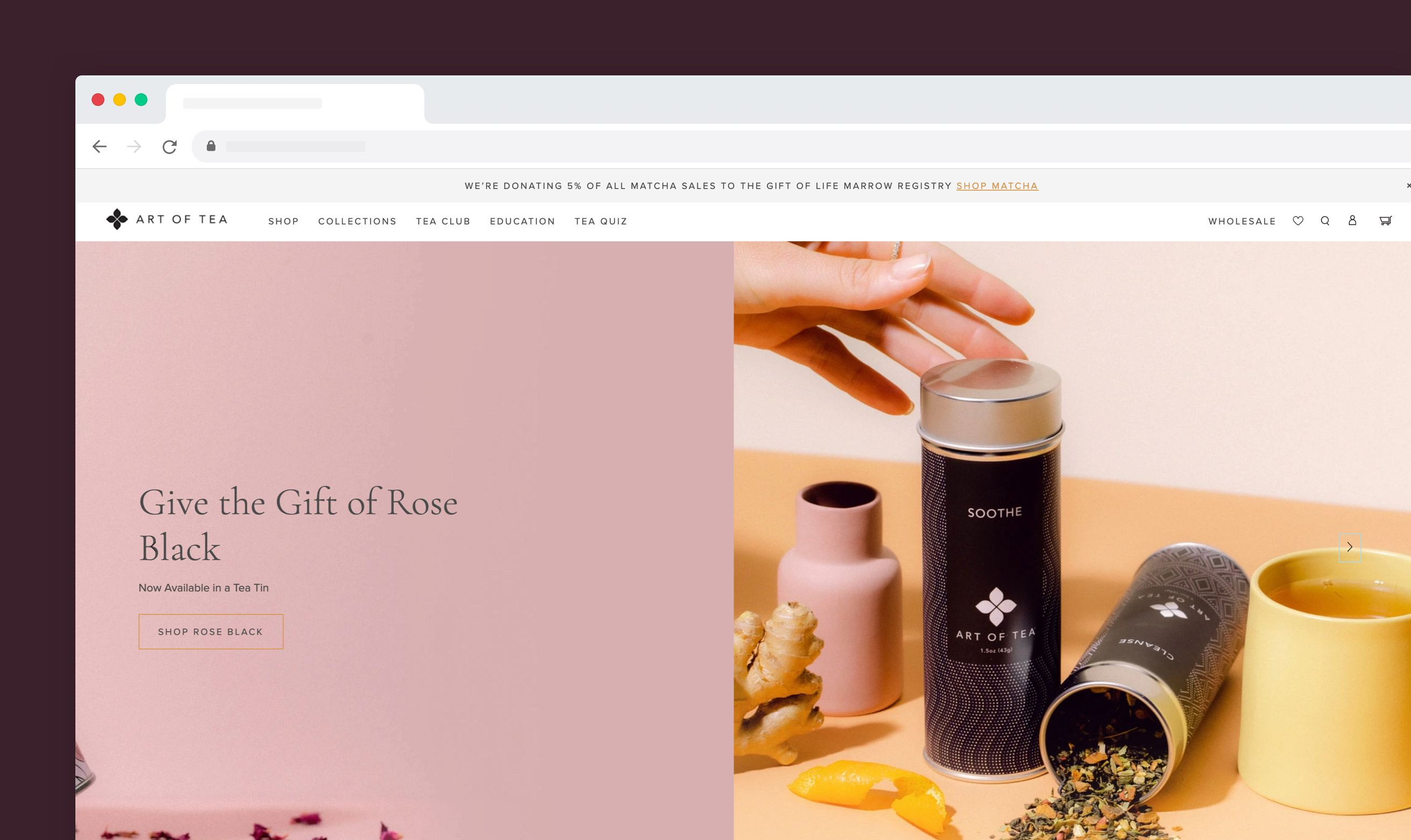
Example 9: Art of Tea
On the website below from Art of Tea, you’ll see many different things in one fullscreen slider.
The opening slider is a CTA to join their affiliate program. Next up are slides showing new tea tins, bags, bundles and shakers. One slide is also dedicated to joining their monthly tea club.
What this carousel web design does well is that the imagery shows what each slide is about, and the supporting text is kept to a minimum. One thing to improve is the buttons. When you choose buttons that only have an outline, it’s hard to see them clearly on the image.
TIP: The tea carousel contains a lot of sliders. Opt for a maximum of five slides per carousel, as it’s unlikely visitors will engage with more. After all the slides are shown, set it to start again (versus stopping at the last slide).
Example 10: Canva Design School
The Design School page from Canva is a good example of an instance where a carousel is more effective than any other website element.
Since there’s a lot of content to be shown on the landing page, a carousel helps to display the different courses more compactly. For example, the tutorial section below takes up a lot more space compared to the slideshow.

Blog carousels
Many times WordPress templates for blogs come with an interactive slider element that automatically shows the latest articles.
While this is a great feature, stay aware of which articles are shown. Some might not be as click-worthy but shown first in your homepage slider because they’re most recently published. In this case, it’s better to manually select the blogs you think will entice visitors to click.
Example 11: COCOCOZY
Interior design blogger Colette Shelton opens her blog with a slider showing a selection of her blogs. Once you hover over, the title of the blog is shown. On mobile, the picture is shown with the title below it.
TIP: Because of the nature of Colette’s blog (interior design), each picture adds value even without showing text. If pictures alone feel out of context, opt for a slider that shows the text without having to hover over it first.
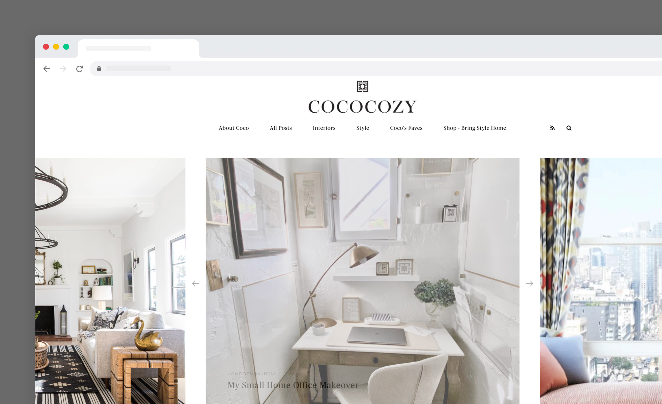
Image carousels
Image carousels are often seen in portfolio-like websites, where it’s used to display pieces of the artist’s work. Make sure that your images are high-quality and speak for themselves, without the need for any additional text.
TIP: Compress your images as much as possible so your carousel loads fast. Especially in photo carousels, all the time your images are loading nothing but blank space is shown to the website visitor.
Example 12: Mix Design Collective
Mix Design Collective is a design company. Since their work is highly visual, it makes sense to open the website with the navigation and a photo slider directly below.
The slideshow has a mix of images, from kitchens to bathrooms and living rooms, so visitors get an idea of the collective’s design style and services.
Comparison carousels
Sliders work well when users need to quickly scan through a variety of content or products. This is exactly the case when people are comparing items. Let’s have a look at some examples.
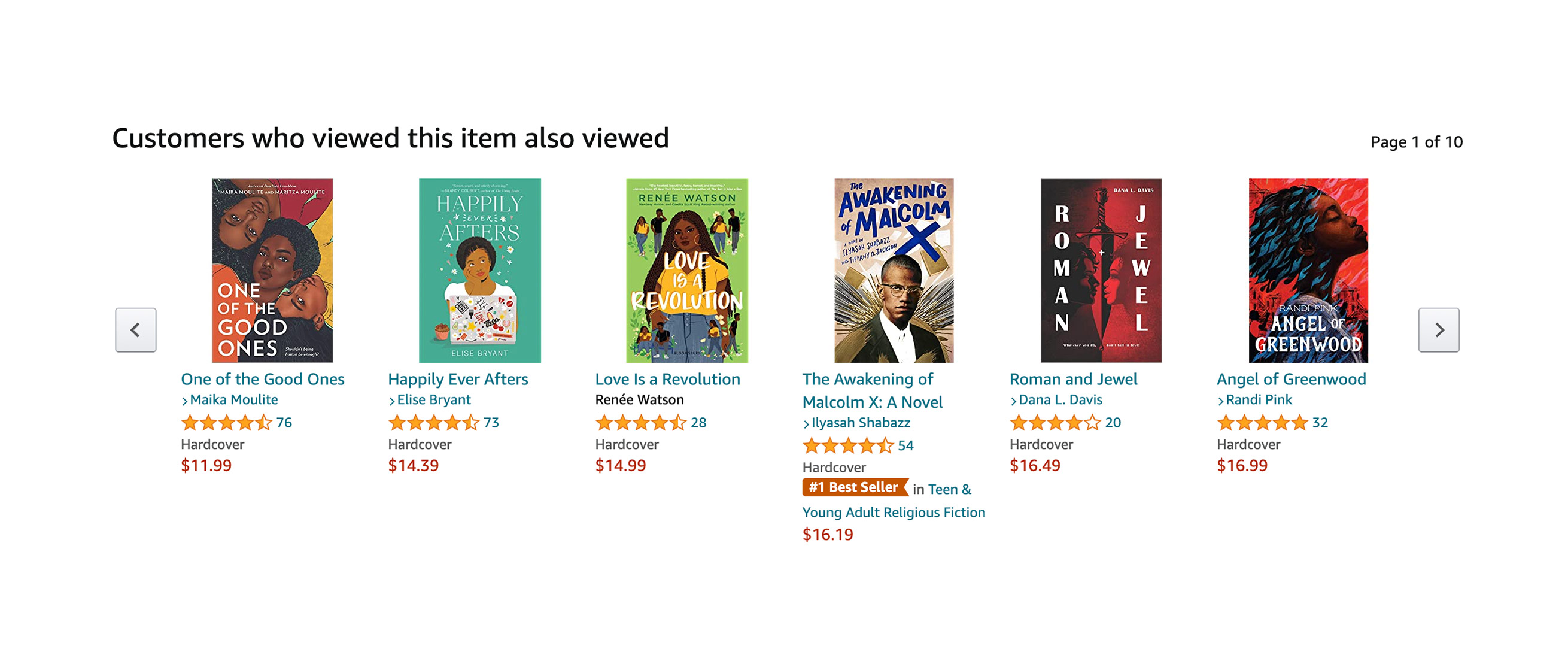
Example 13: Amazon
Arguably the most known comparison example comes from Amazon. On each product page, you’ll find a carousel with all the related products you could buy as well. In this case, a slider is more effective than static images, as it allows users to quickly browse through many similar products.
What’s your take on website carousels?
As you’ve read, web sliders can be a yes please or a please no. It all depends on how the element is used in your web design and how user-friendly the slider is to navigate. Make sure each slide serves a clear purpose and the overall user experience is great. If you can confidently say that a slider is the best element to display the content, you’re good to go.
Get your project started today
Discover our intuitive visual editor, use built-in CMS collections, SEO features and launch your web projects with ease.