


States
When styling, use the States menu to toggle between conditions like Hover and Current for quick adjustments.
States are visual representations of a specific element or component at that particular time. Below we'll talk about the different states that you can edit in Ycode, and what each state does, exactly.
Switching to different states
In the editor, go to the right-hand side on Design, under the Layer styles you will have Neutral, this is where you can change your states.
The default neutral state shows your website in its regular state. If you want to edit website elements in another state, click Neutral, open the menu, and pick a state.
Now that you know how that works, let's explain what each state means.
Active
This state means that the element is highlighted, whether by default or initiated by the user.
Example: Your website has a menu with different menu items. The menu item that’s selected is the active one.
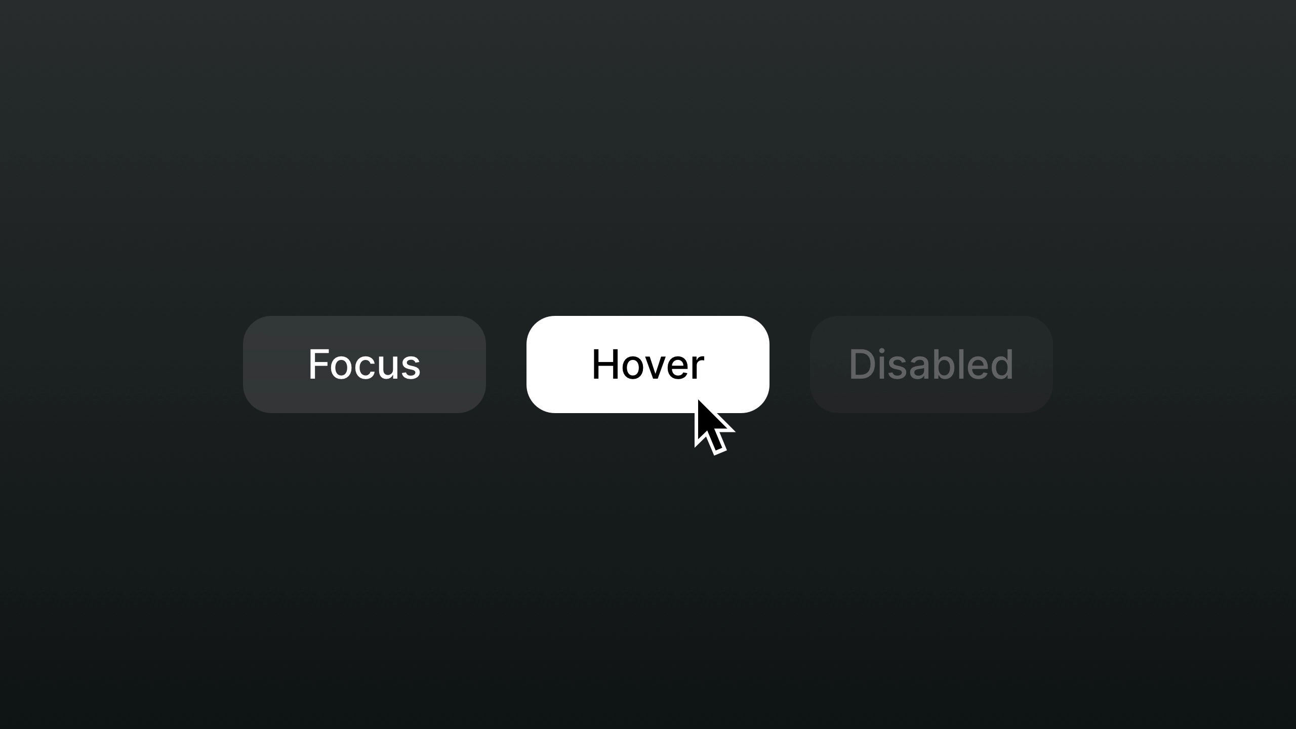
Hover
This state happens when someone places their cursor above an element, hovering over it.
Tip: Most touch devices don’t make hovering possible, so on smaller screens, your hover design might not be shown.
Focus
This state happens when someone highlights an element, using an input method. Focus states are also often used for links and input fields, like in a signup form.
It’s good practice to add a border or shadow to focus items, so people can see this visual cue and follow where they are on the website.
Though it can make your design a little less clean, it does guarantee a great user experience.
Disabled
The disabled state is used when you want to disable elements.
This state can be used in when editing loading state for "Load more" pagination type or slider element arrows, where there are no next or previous slides to come.
Current
By styling current links, you're giving web visitors a visual indication of the page they're currently visiting. This might seem like an insignificant detail, but it can improve someone's experience on your website or app a lot!