In the Layout section, you can pick six different ways to display your content.
Block
These elements spread over the full width of their parent element. Each block element starts on a new line (vertically) and takes up all the width space that’s available.
Blocks are great to position things below each other. If you have three images in block elements, they will be vertically stacked—even when there’s enough space to fit the images next to each other.
Inline block
Inline blocks combine the best of both worlds. Like blocks, they can have a set height and width. And because it’s inline, elements are placed side-by-side on the same line (as long as there is enough space available).
Inline
Inline means the elements inside are placed in-line, so horizontally next to each other. Unlike block elements, the height and width cannot be manually set.
An inline element will adapt to the other content that’s placed in the same line.
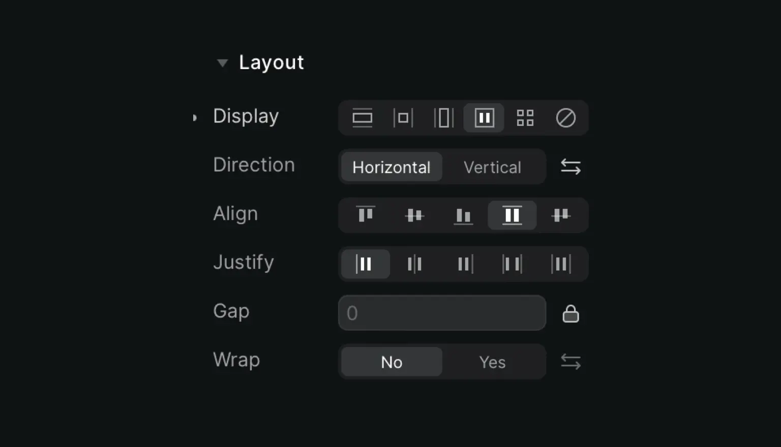
Flex
These elements have a flexible structure and you can arrange them either horizontally or vertically. You decide how they’re stacked, aligned, justified and wrapped within the flex container.
Flex containers dynamically expand to fill all available free space, and shrink so the content doesn’t overflow.
Grid
In this layout structure, elements are positioned within rows and columns. For each grid item, you can decide how content is positioned, aligned and distributed.
There are multiple customization options you can use to create your grids, so let’s talk about them:
Grid: here you will be able to set the number of Columns (max: 12) and Rows (max: 6) your grid can have.
Gap: you will be able to set the gap between columns and rows with the ability to set them individually by clicking on the lock icon.
Flow: you can choose the way items will fill your grid, either by filling the columns or rows first.
Align: determines how the elements as a whole are aligned within the container
Content: determines the spacing between lines
Hidden
By hiding a container, the container space will remain but you will not see its content.
This option is often used to hide elements that first need to become visible when a visitor clicks a button.


