The position defines where the element is positioned on the page.
There are five different positions to choose from.
Static
This is the default position of all the elements on your page. Static elements appear in the order they are stacked and won’t overlap when there’s no styling added.
Fixed
Fixed elements are positioned relative to the screen size and will stay visible (aka remain in the same place), even when a visitor scrolls down your page. This setting is often used for fixed navigation bars that need to be visible at all times.
Absolute
Its position is not affected by other elements, nor does it affect them. This means you can place items wherever, but be aware that this can limit the flexibility (flow) of your website.
Absolute values are relative to the next parent element that has settings other than static. If there are no such elements, it’s relative to the page itself (body).
Tip: If you want to absolutely position an element within a specific parent, you first need to change the position of the parent to anything but static.
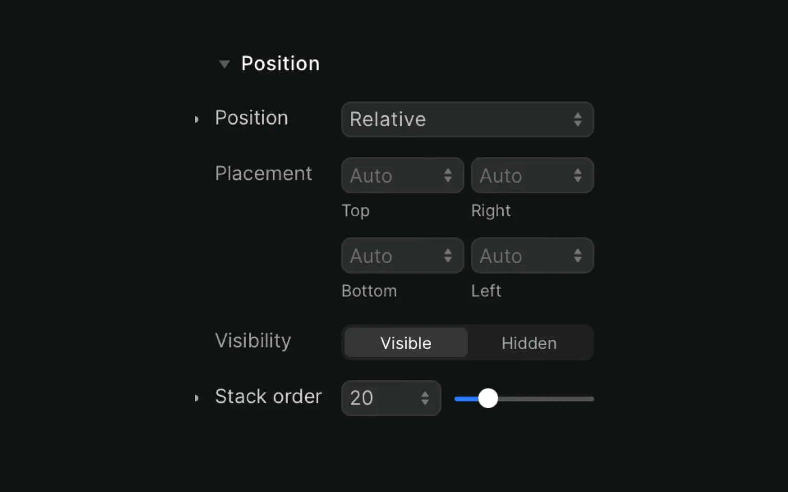
Relative
Important to remember with relative positioning is that it’s relative to itself.
If you add 50px on the top, it will move up 50 pixels from where it would normally be positioned if it was static. Other elements will not adjust to fit the gap created by this position change.
Relative positioning is great to create overlaps, as the change does not affect the position of other elements nor does it mess with your document’s flow.
Keep in mind: When you use the relative position, two things will happen. Firstly, the element will be displayed on top of any other static element. Secondly, it limits the scope of any child elements that are absolute. Elements that are a child of a relative element can be positioned absolutely within that block.
Sticky
Sticky elements mix fixed with relative positioning to create something unique!
Let’s say you have a menu where names are categorized from A-Z. Your table contains a header for A, B, etc. and the corresponding names are below each header.
Now, when you scroll through all the names starting with A, the “A header” will stay fixed on top of the screen so it’s always visible. When you get to the B names, the “A header” will disappear from the screen (relative) and the “B header” will be visible as a fixed header element.
For sticky positioning to work, you need to select at least one value for the top, right, bottom or left side. If your parent element has a set height, or the overflow is set to hidden, scroll or auto, sticky positioning might not work.
Sticky elements are supported in Firefox, Safari and Chrome Canary (56+).


