Let’s first talk about how to set measurements for elements in Ycode.
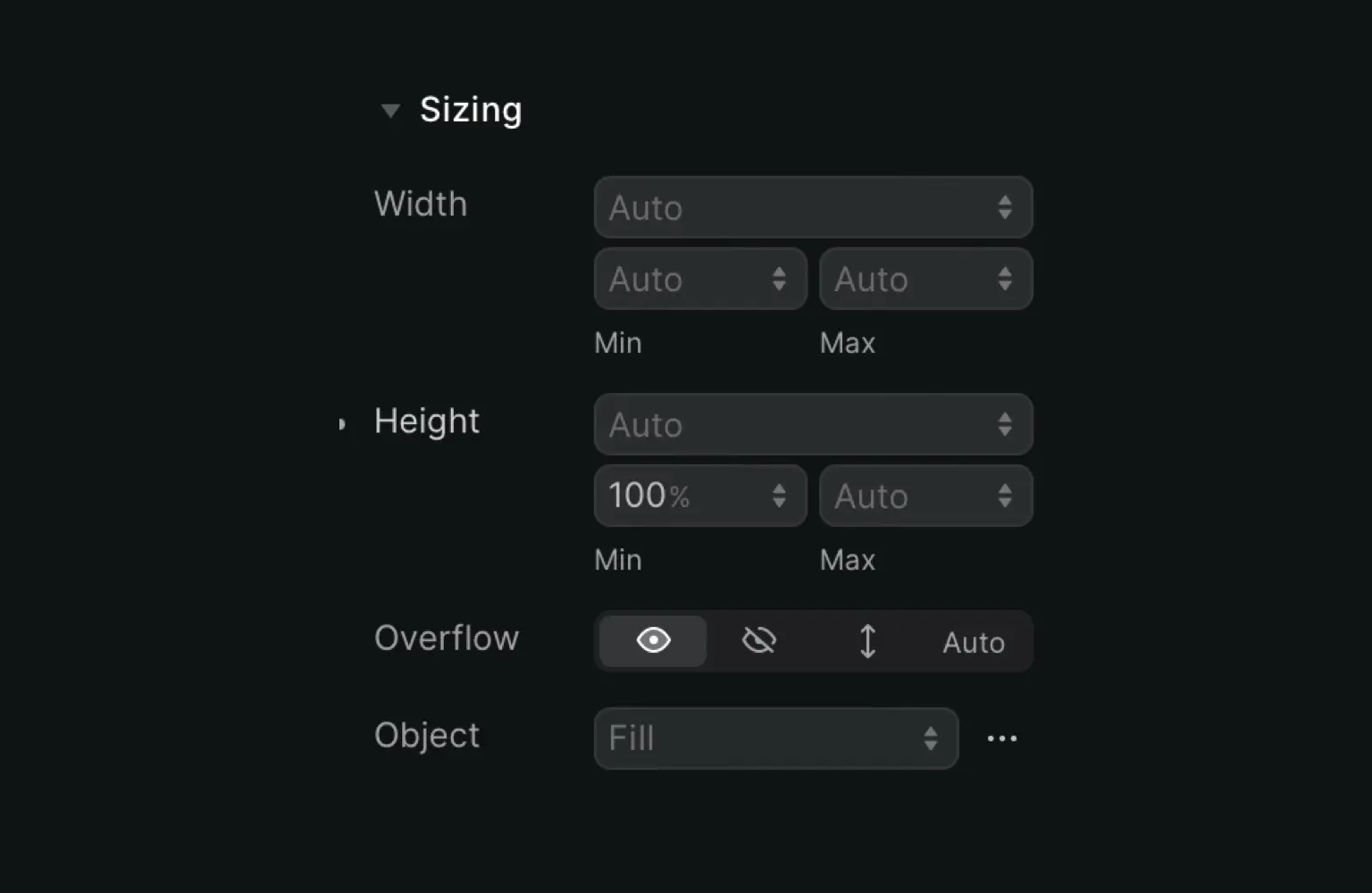
Choose an element, open the Design settings on the right side and open Sizing.
Now manually input a value and choose the desired sizing unit. There’s a wide selection of units to choose from:
Pixels px
Percentage relative to the parent element %
Relative to the font size of the root element rem
Relative to the font size of the element em
Equal to the used x-height of the current font ex
Relative to the width of the “0” ch
Line height of the element lh
Viewport width vw
Viewport height vh
Viewport minimum vmin
Viewport maximum vmax
Viewport is the current visible area of a web page (not including scroll and toolbars). The size varies depending on the user’s screen size.
The measures vh and vw are equal to 1/100 of the height or width of the viewport.
The units vmax and vmin relate to the maximum and minimum values on vw and vh. The difference is that vmax and vmin can differ when a browser window is resized or the orientation of a mobile phone changes.
How to set width and height
You can set the width and height of elements in many different ways.
Manual: Input the value manually and choose the prefered sizing unit
None: Element won’t take up any space
Full: Element uses 100% of its parent element (if the parent is 2000 px, the child element is too)
Auto: Width and height automatically adapt and are responsive
Screen: Element uses 100% of the width or height of the viewport. On a mobile screen, the element is only as tall or wide as what fits on the screen
Content: Choose between Min-content or Max-content. Min-content defines an element’s minimal possible size where content doesn’t overflow. The max-content assumes there’s infinite available space
Columns: Choose a specific % of space that the element can take up from 8.3% (1/12 of the screen) up to 100% (12/12 of the screen)
You can also choose a minimum and maximum width and height for each element.
Overflow
Content might also overflow its container, this happens when there’s a set width and height, and not enough room inside the container.
By default, overflown content is visible (eye icon). If you want to hide all content that’s outside of its container, click the eye icon with the diagonal line across it. This clips the content.
You can also click the arrows pointing up and down to add a scroll bar to the element. Choose Auto if you want to allow a scroll bar, but only automatically add it when needed.
Object
Here you can choose which object fit is best for the element. When you have an image, this setting allows you to select how the image should resize to fit the container.
There are five options:
Contain: Content is scaled to fit its container while keeping the aspect ratio, so your images won’t look weirdly stretched. Videos will have the letterbox effect
Cover: Content is scaled to fit the entire container, and everything that doesn’t fit is clipped
Fill: Content is scaled to fit the entire container and will be stretched when needed
None: Content is not scaled
Scale down: Content is scaled down, either using None or Contain (whichever option results in the smallest size)


